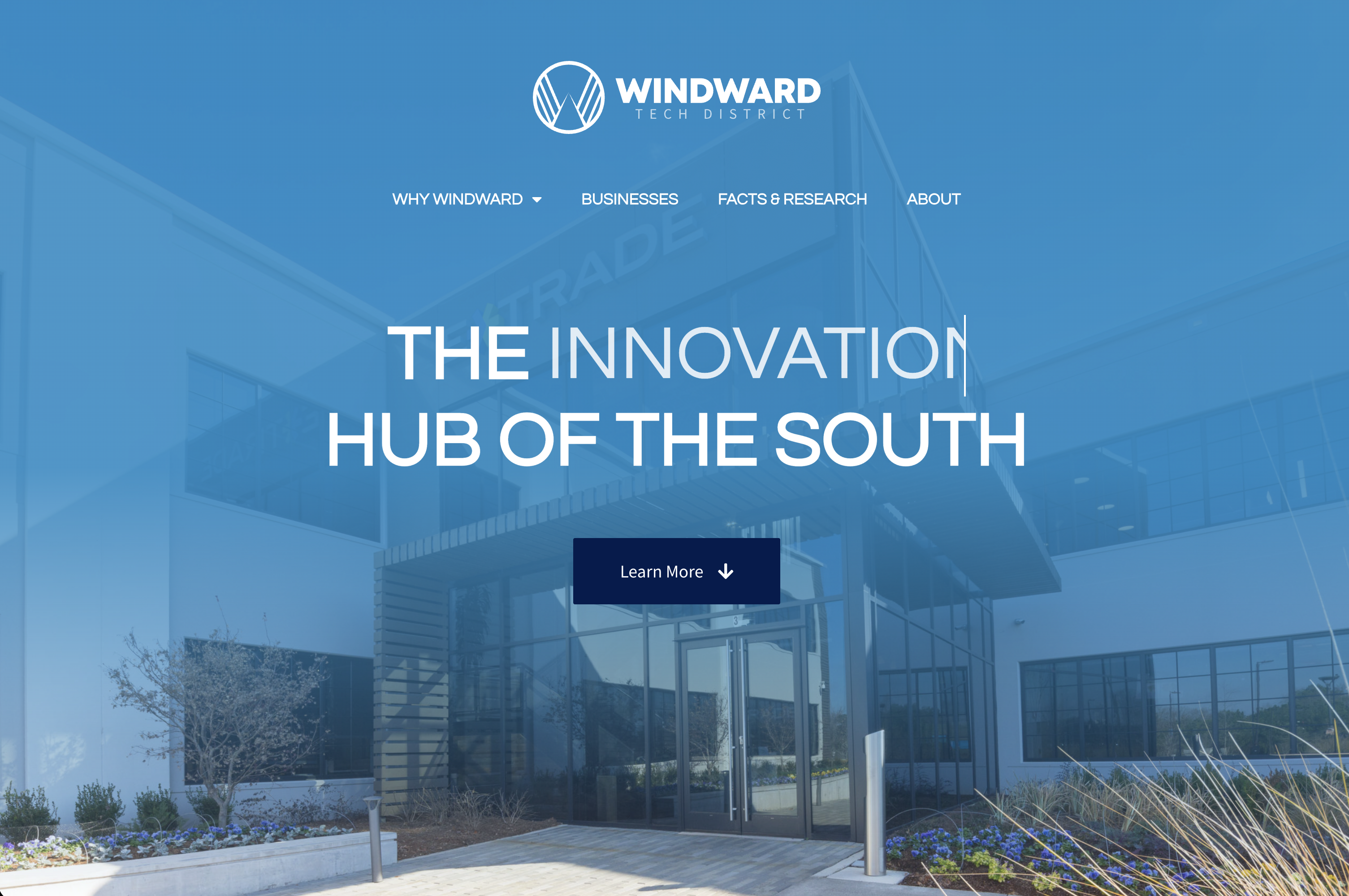
The Tech Hub of The South
A brand and web presence positioning Alpharetta's Windward as the tech hub of the south - launched in 4 weeks
Windward Tech District needed an identity and a launch site that could rally developers, employers, and city stakeholders around a single story: this corridor is where the south's tech economy lives. Everything had to be ready in a month.
• Discovery
Deep research into understanding the district's rich history and full potential
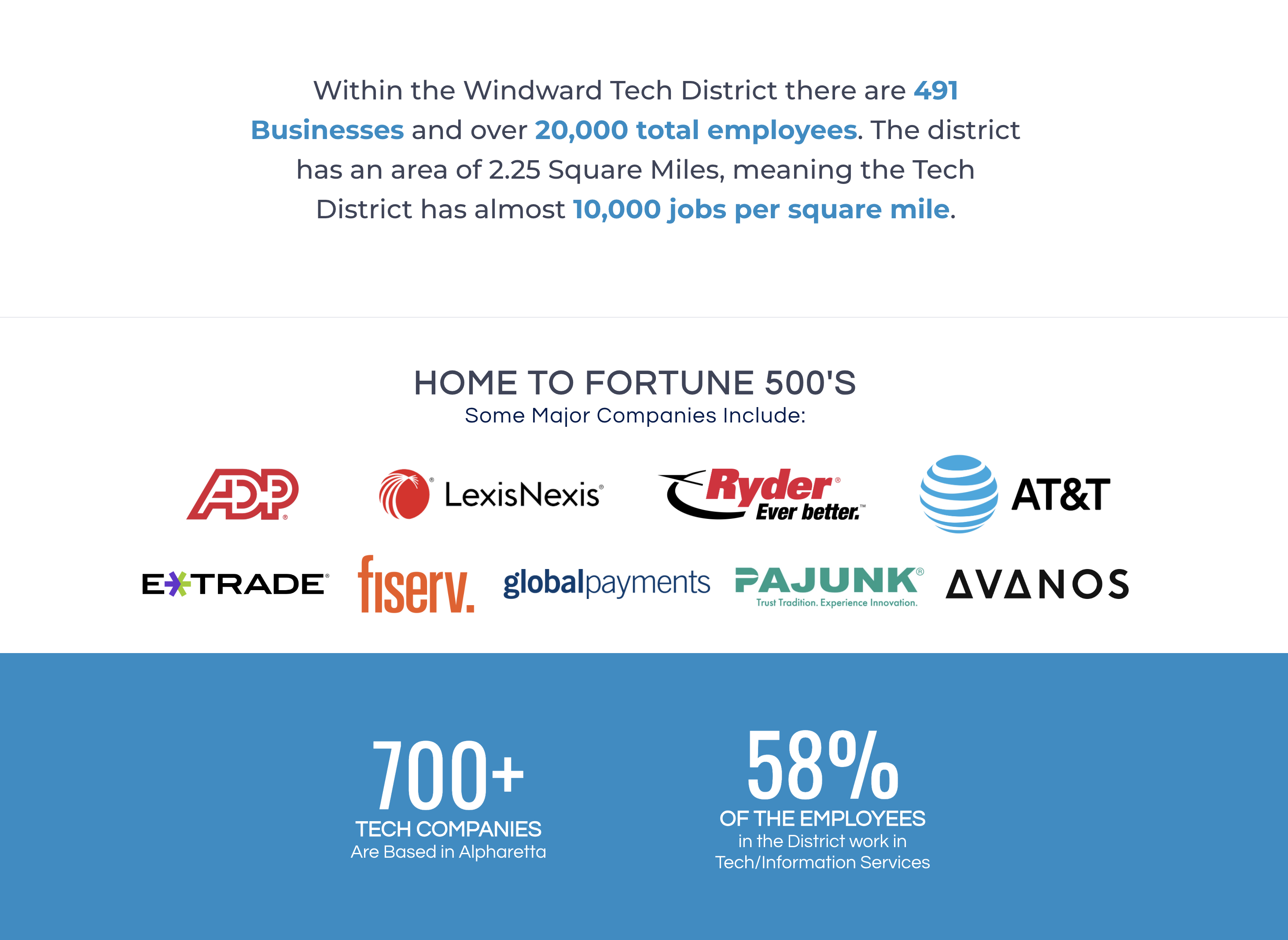
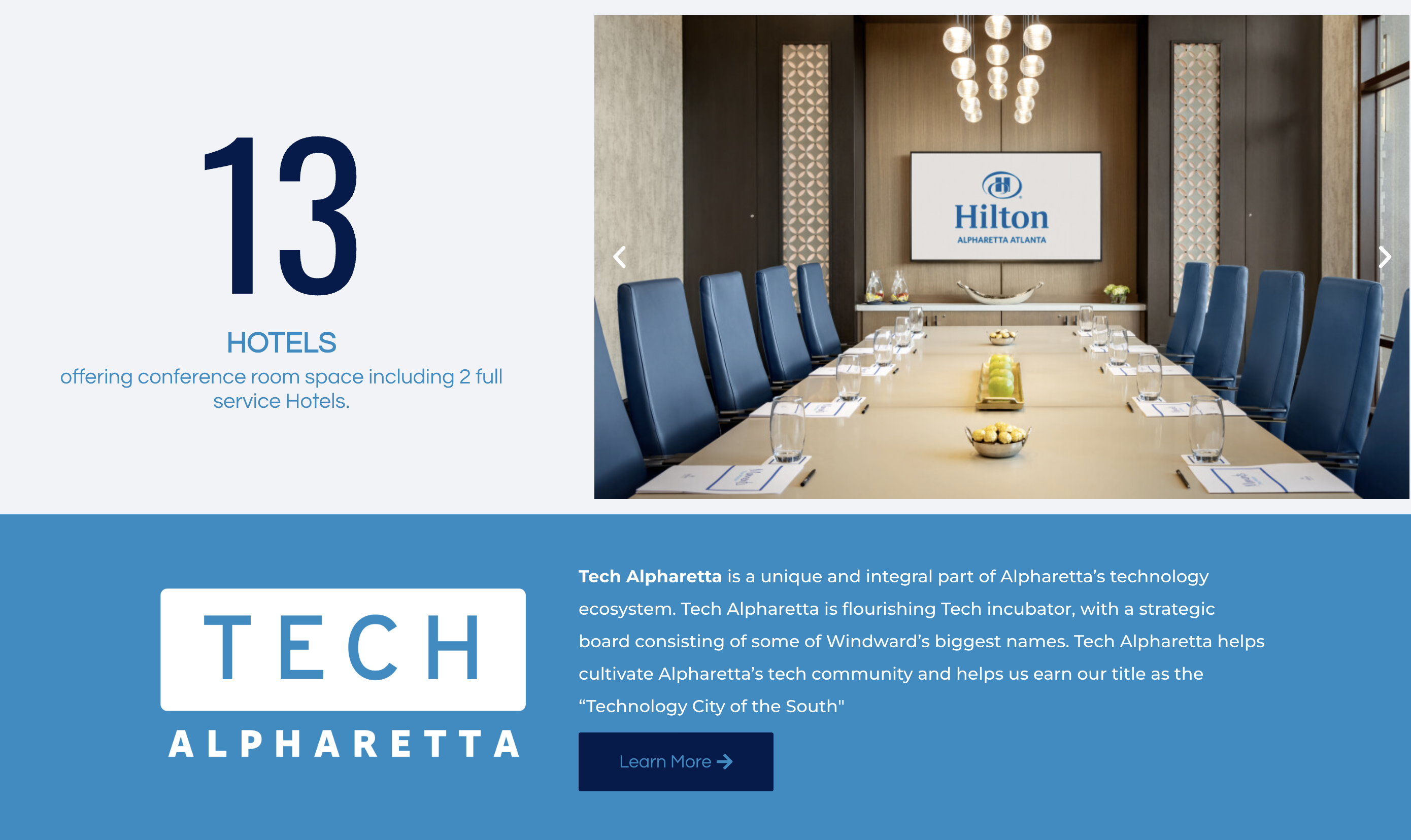
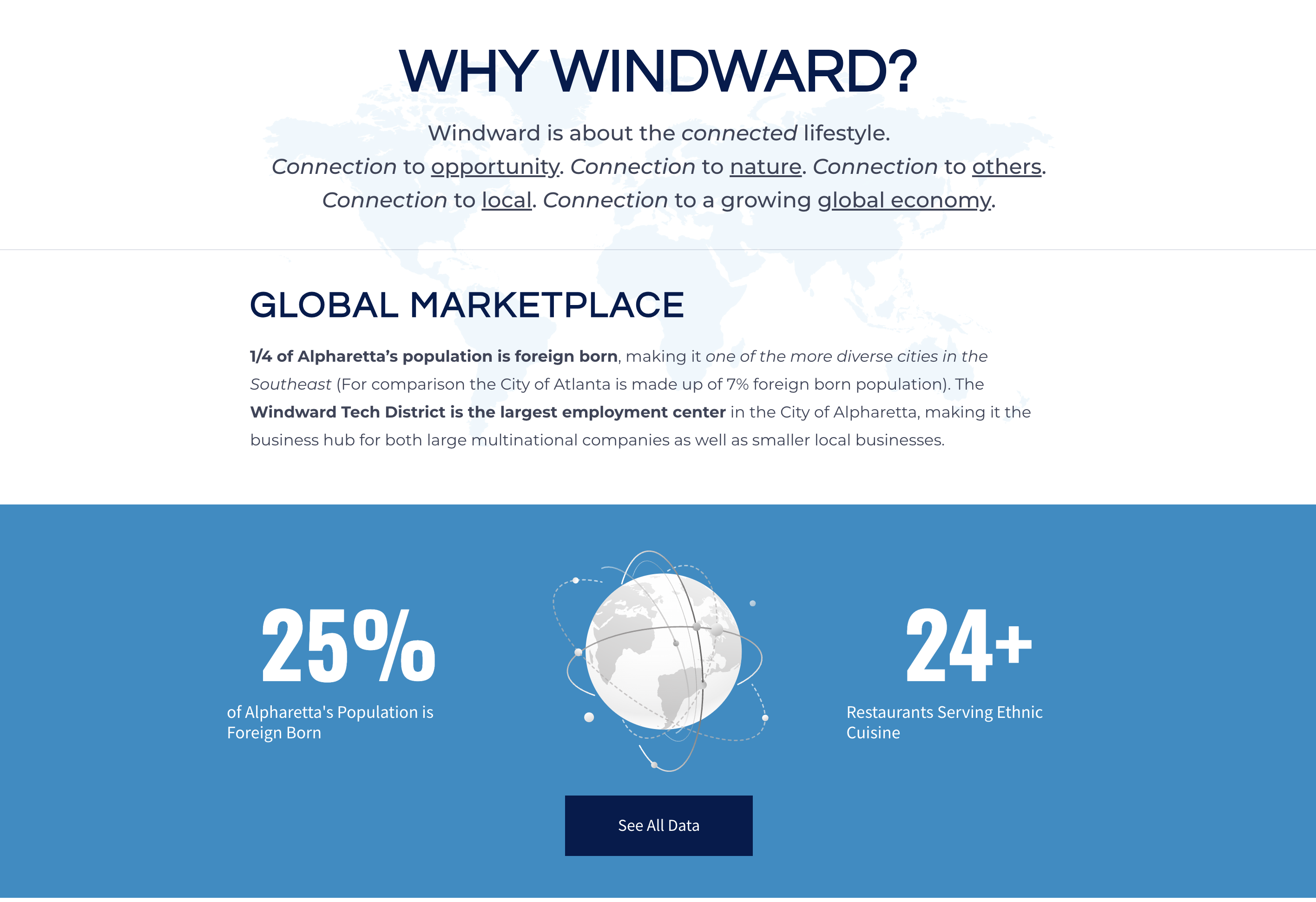
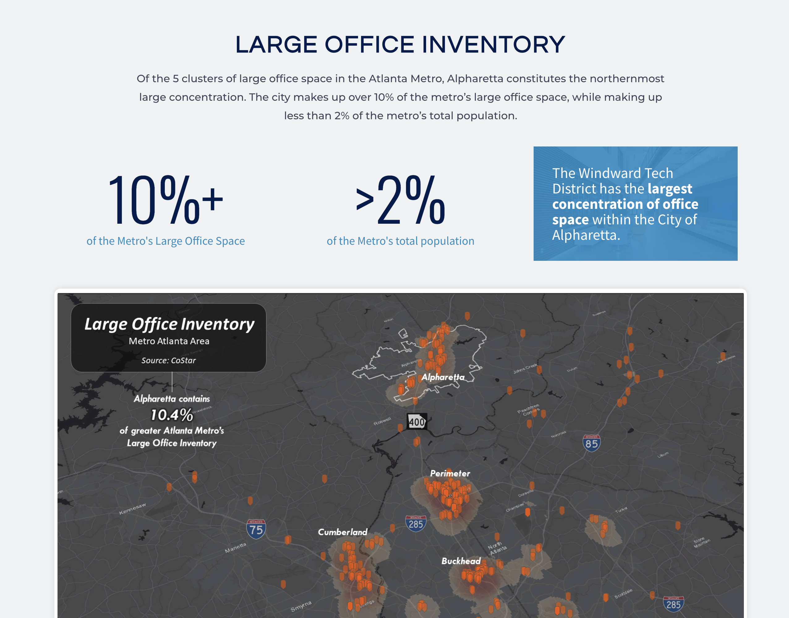
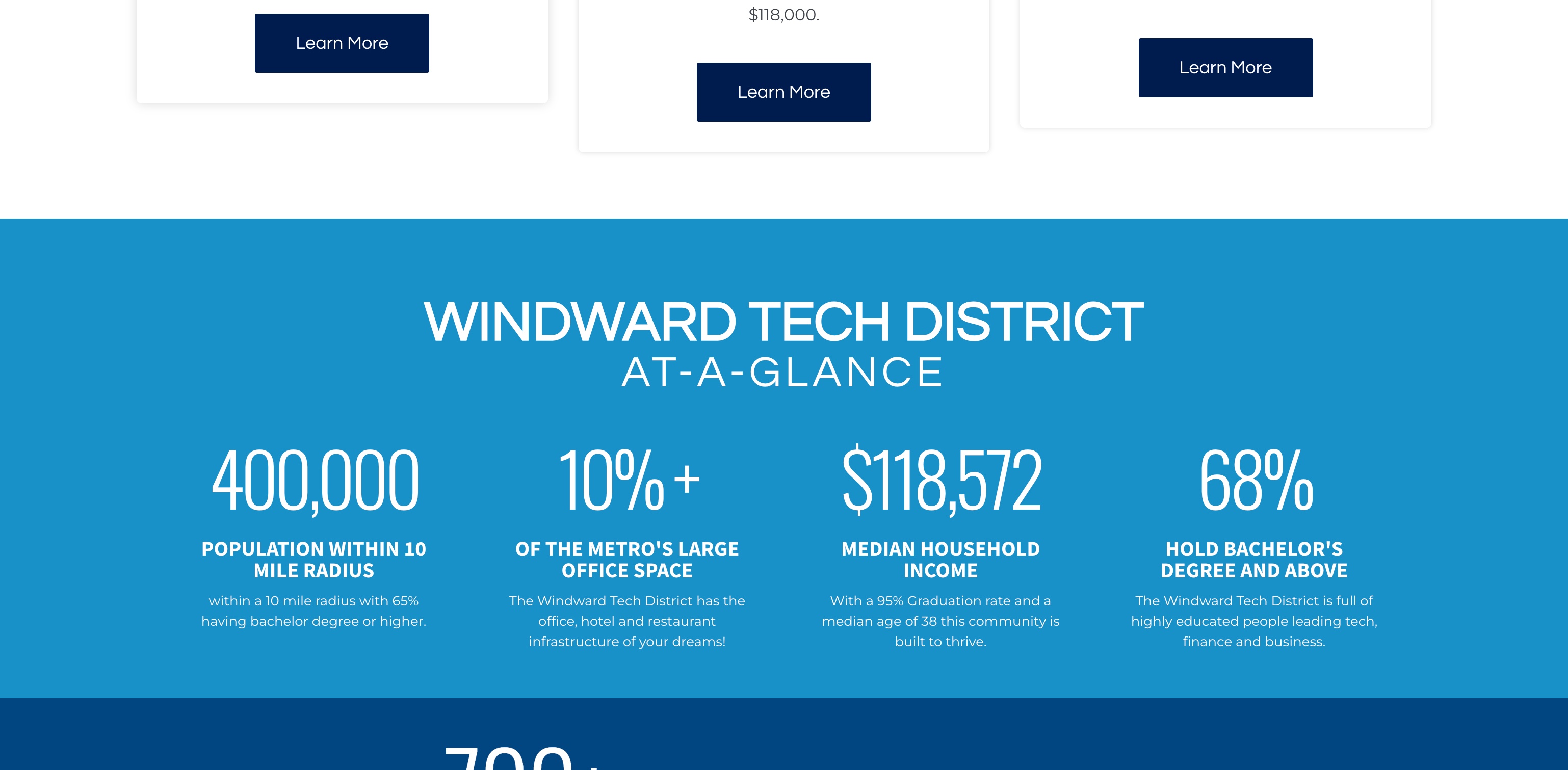
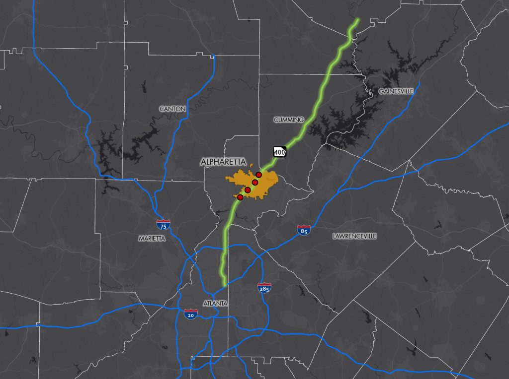
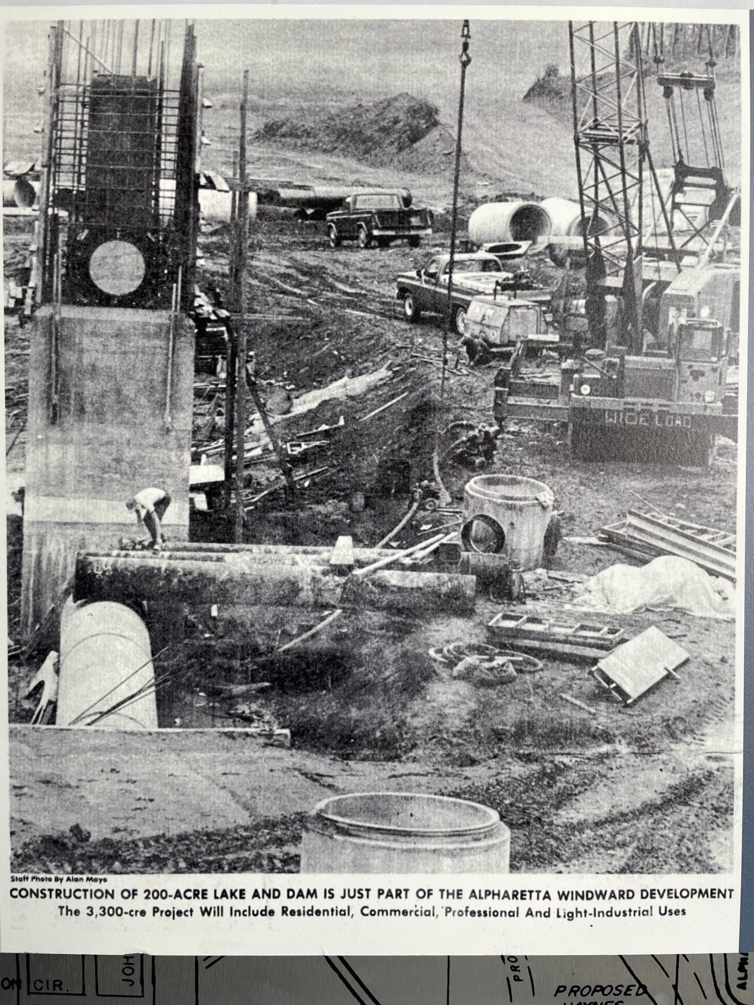
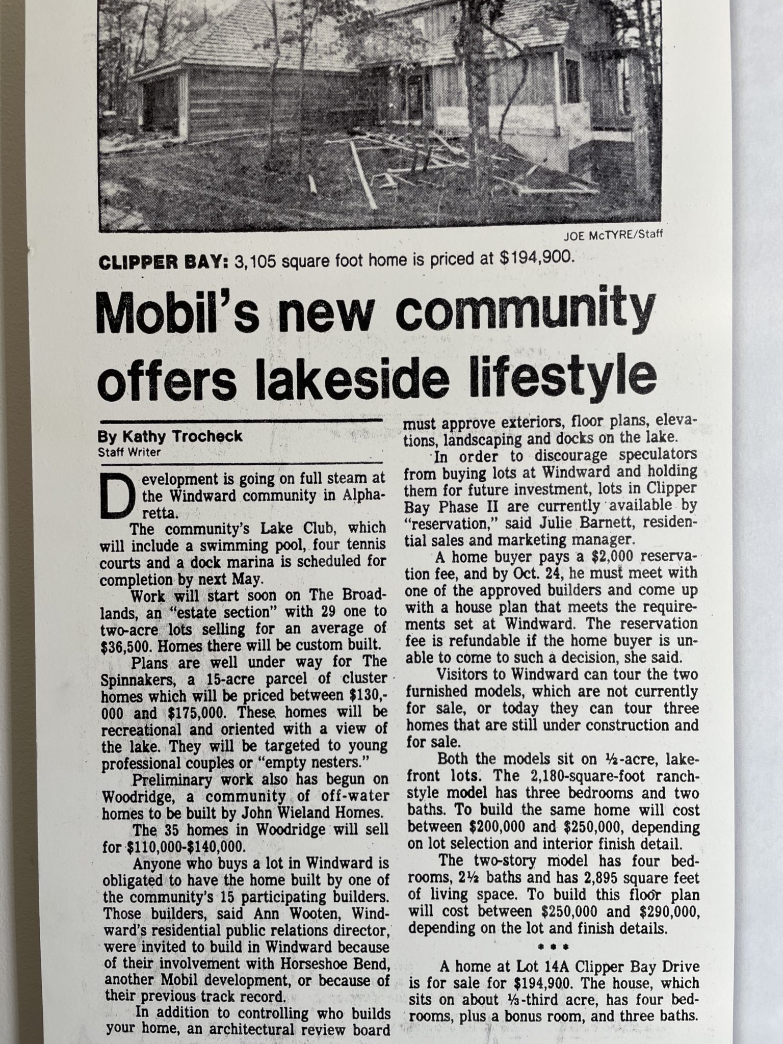
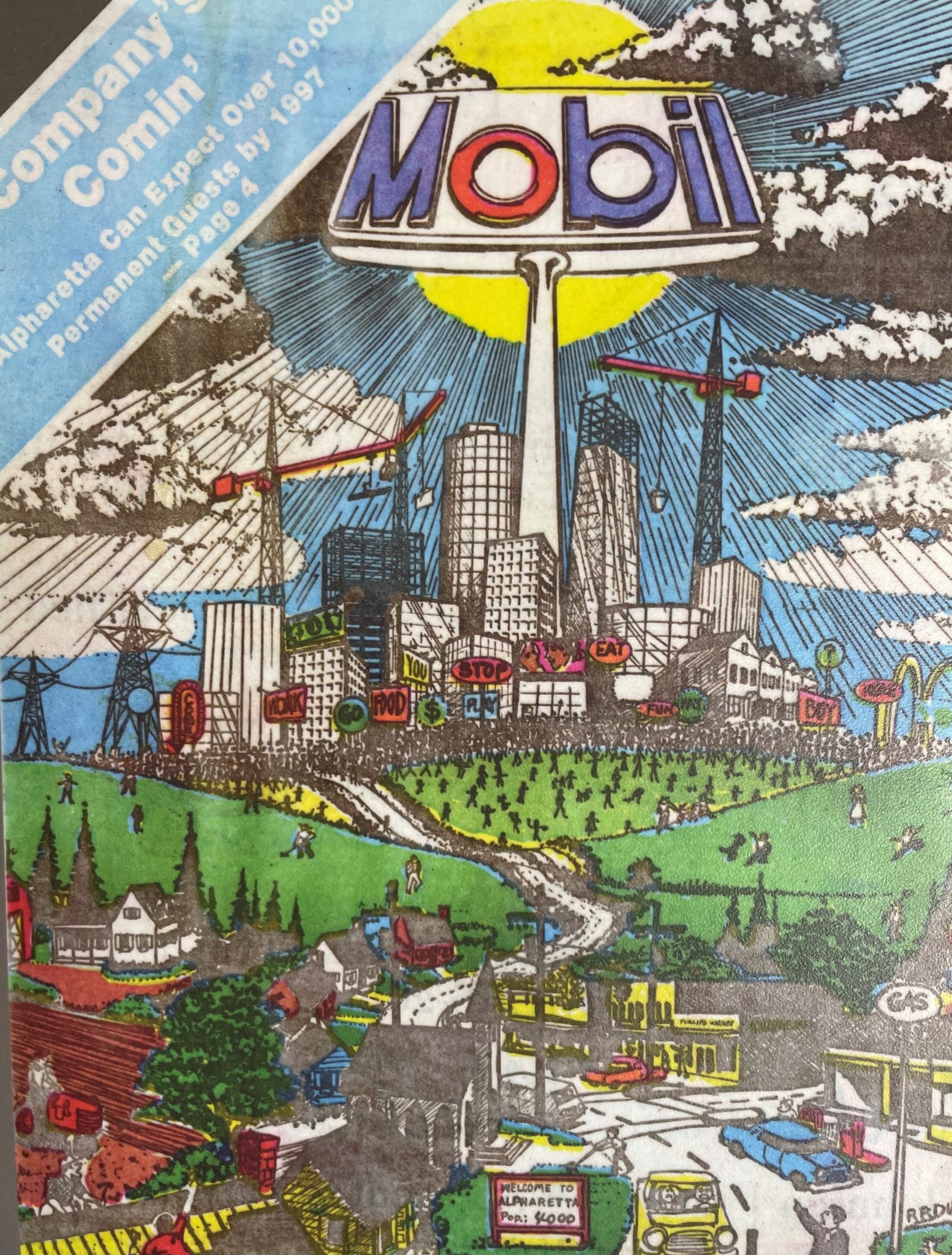
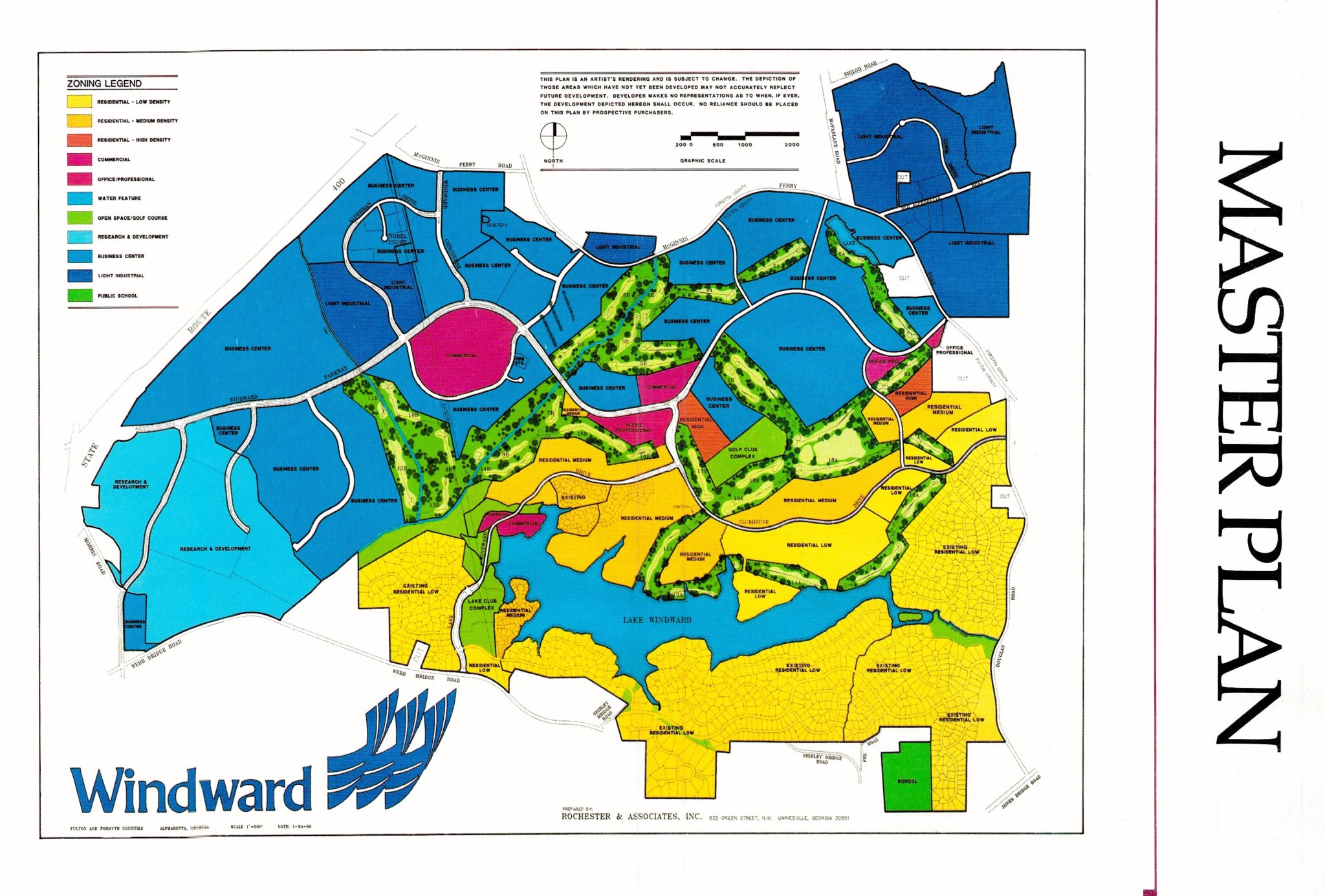
Before any design work, I dug into Windward's history, economic data, and live/work lifestyle. The corridor has one of the densest concentrations of tech employers in the southeast - but no shared story. Research surfaced the narrative: a walkable, amenity-rich district where talent wants to be, not just work.
That story had to be grounded in real data - tenant density, infrastructure investment, greenway access, proximity to talent pipelines - before it could become a brand.
• Brand
Logo, identity, and a style guide built by committee
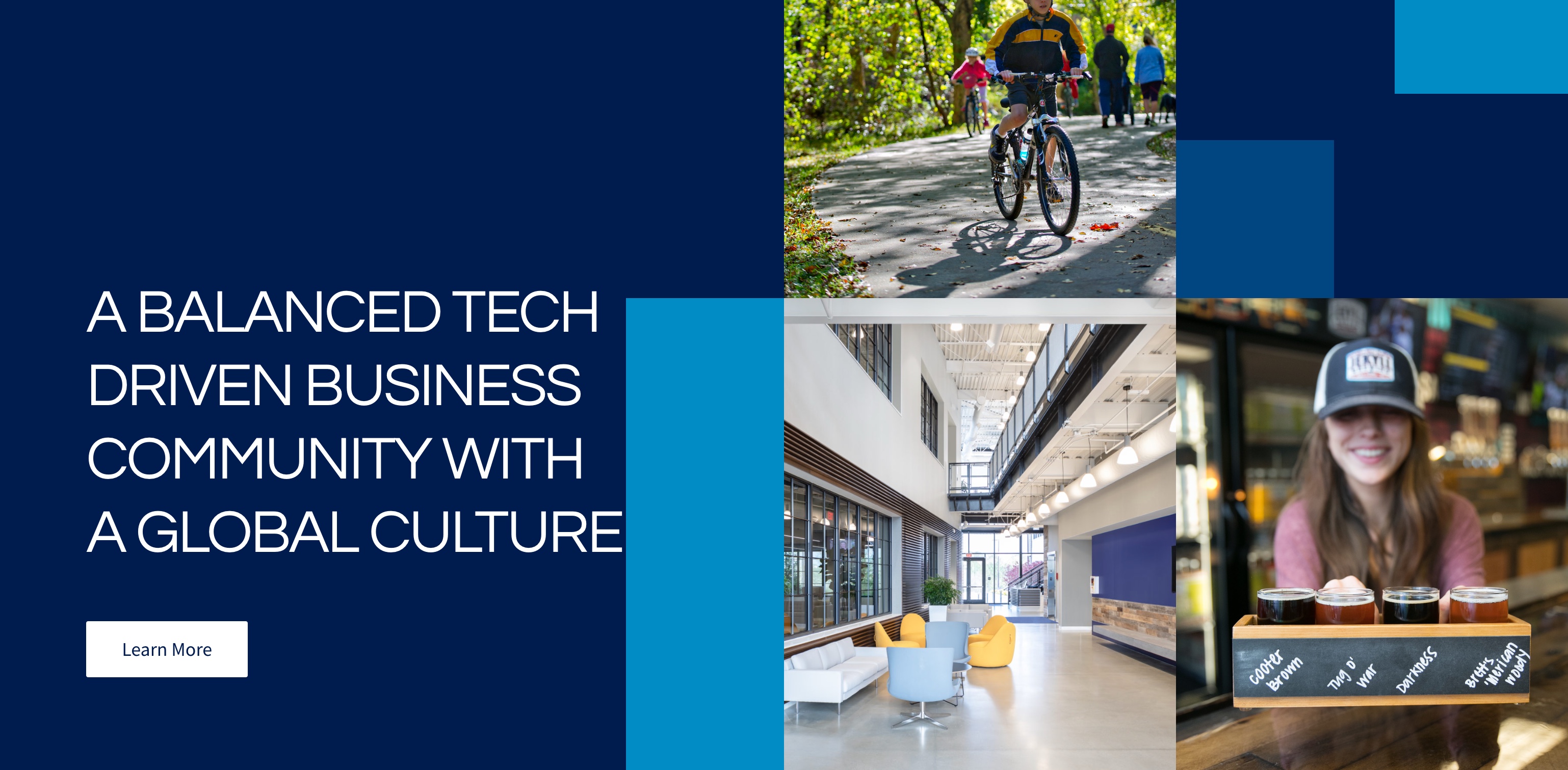
The brand process involved multiple logo directions, stakeholder presentations, and a committee vote to align city, developer, and employer voices on a single mark. The result is an identity that feels authoritative enough for city government and energetic enough for a tech corridor.
Blue, light blue, and green emerged as the favored palette - bold enough to own a color story, clean enough to work across signage, digital, and print. Every direction was pressure-tested against the brief: tech-forward, never cold.
• Website
Built to pitch, built to last. Live in four weeks.
The site needed to work as a pitch deck and a public destination at the same time. Custom vector graphics and scroll-driven animation tell the Windward story from district overview to tenant benefits - fully responsive and mobile optimized.
Every section was designed to persuade a different audience - the developer looking for a headquarters, the talent weighing a move, the city stakeholder tracking ROI. One site, one story.