Precision Parts Trusted by Moon Missions & Military Aircraft
Positioning a decades-old precision manufacturer for the projects that actually need them
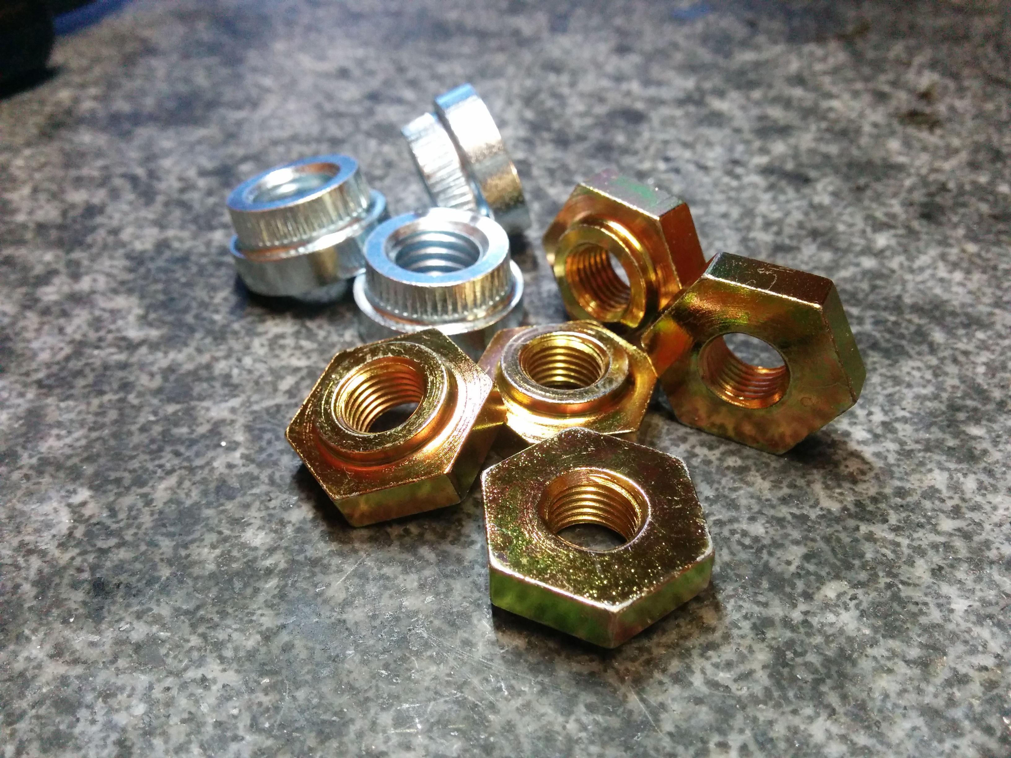
Stanlok Corporation has spent decades machining custom nuts, pins, and precision components for American industry - from moon mission hardware to military aircraft programs to the specialty parts other shops won't touch. The site needed to pull that legacy forward: a clear product taxonomy, fast RFQ pathways, and a presence authoritative enough for aerospace and defense buyers evaluating a long-tail supplier.
What was included
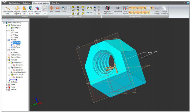
I built the full site end to end, structuring a deep product catalog into a scannable, RFQ-driven experience. The project also included the design of a comprehensive, custom iconography system for every service and product line.
Strategy & Copy
- Product Taxonomy & Strategy
- Content Architecture
Website & Systems
- Custom Website Design
- Web Development
- RFQ System Architecture
Brand & Assets
- Custom Iconography System
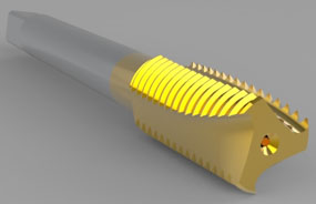
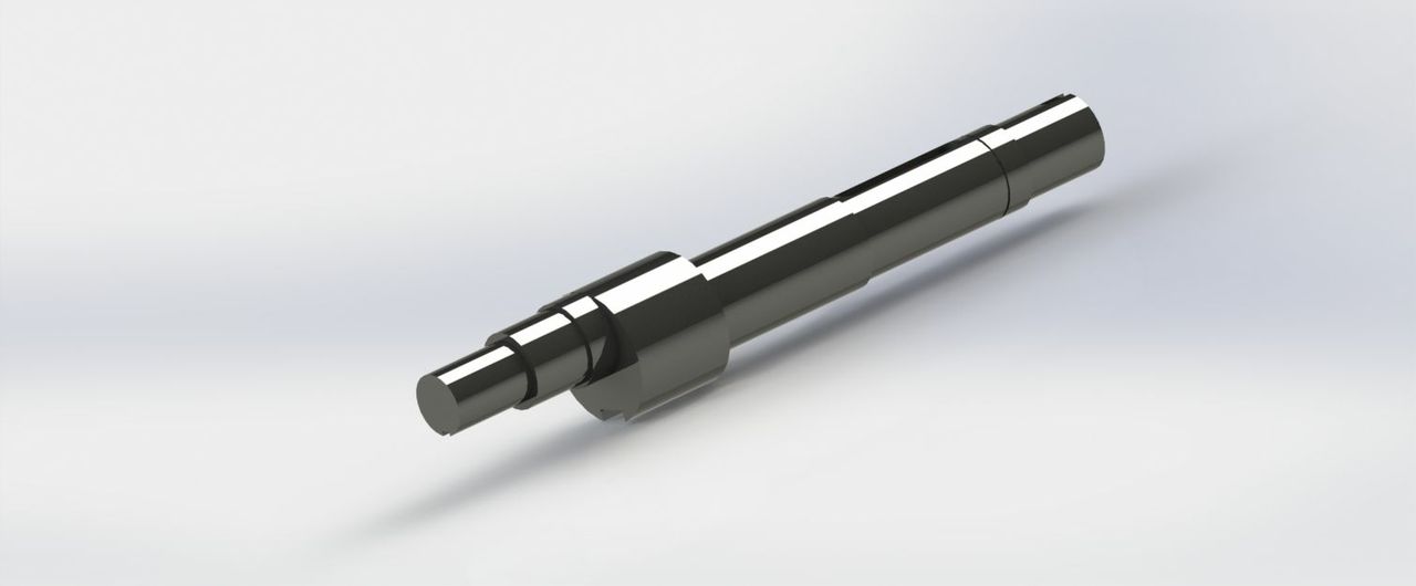
- Product Render Integration
- Brand System Design
• Website
A product-led site that gets buyers from landing page to RFQ in a few clicks
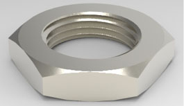
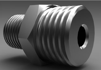
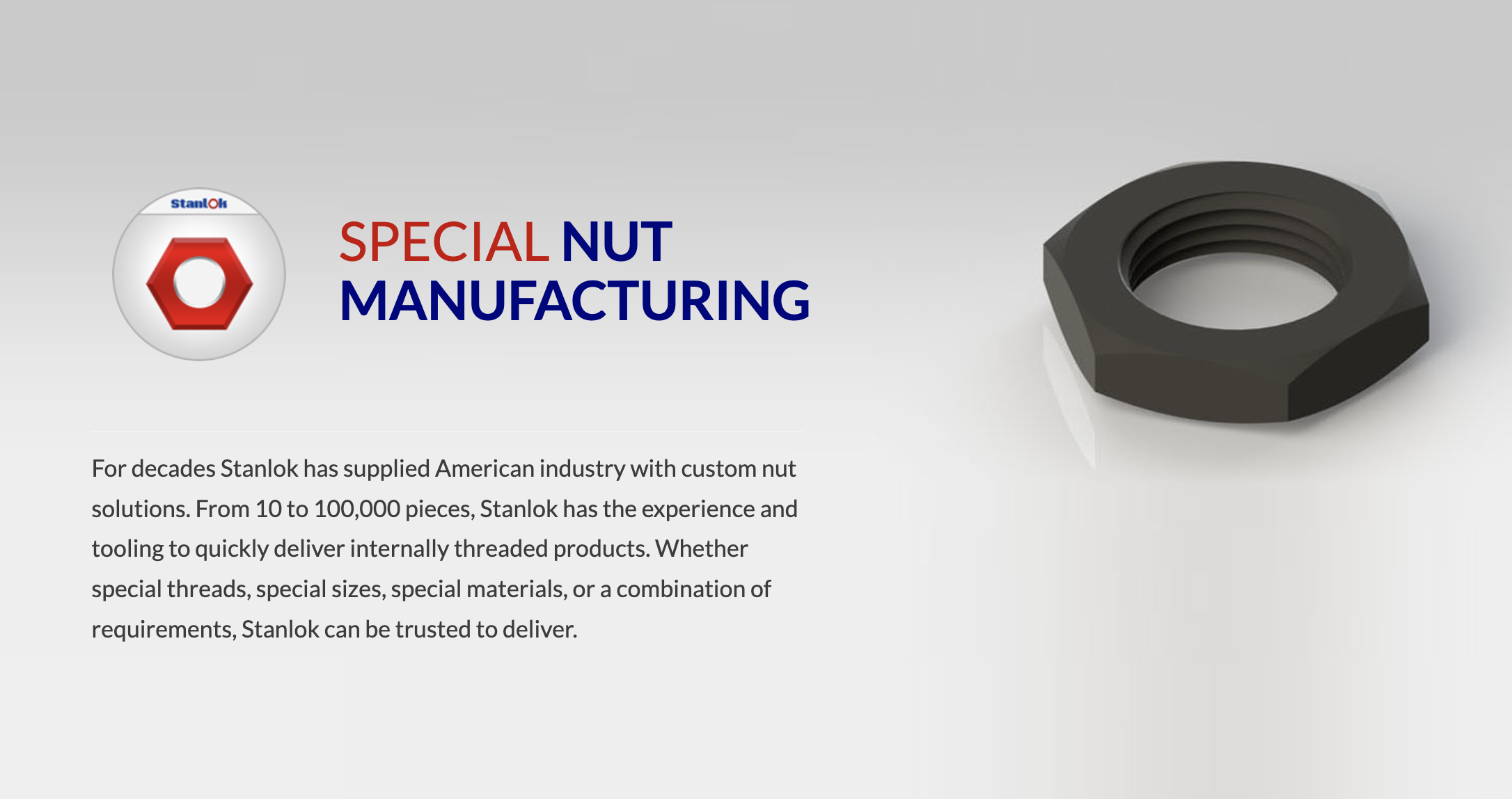
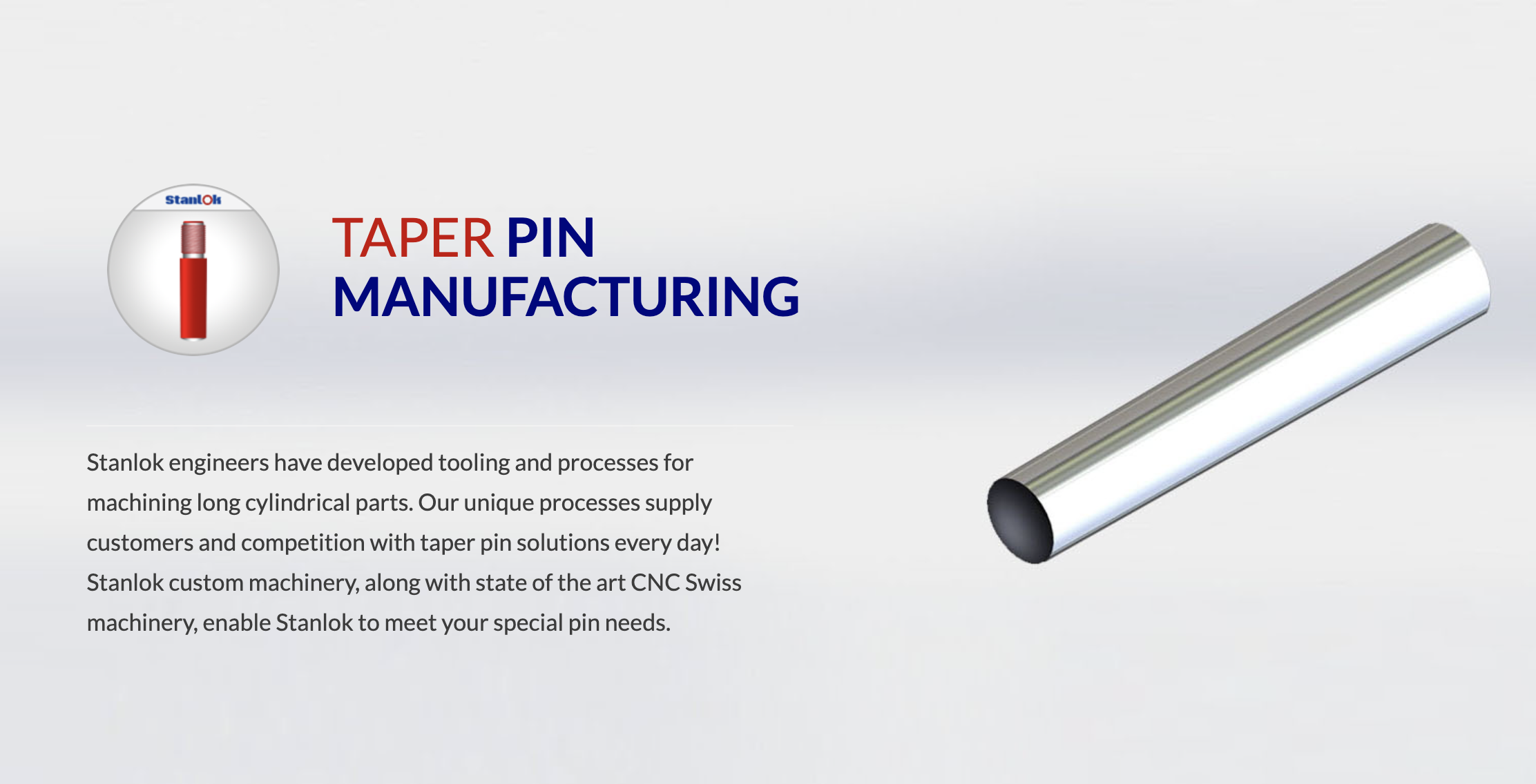
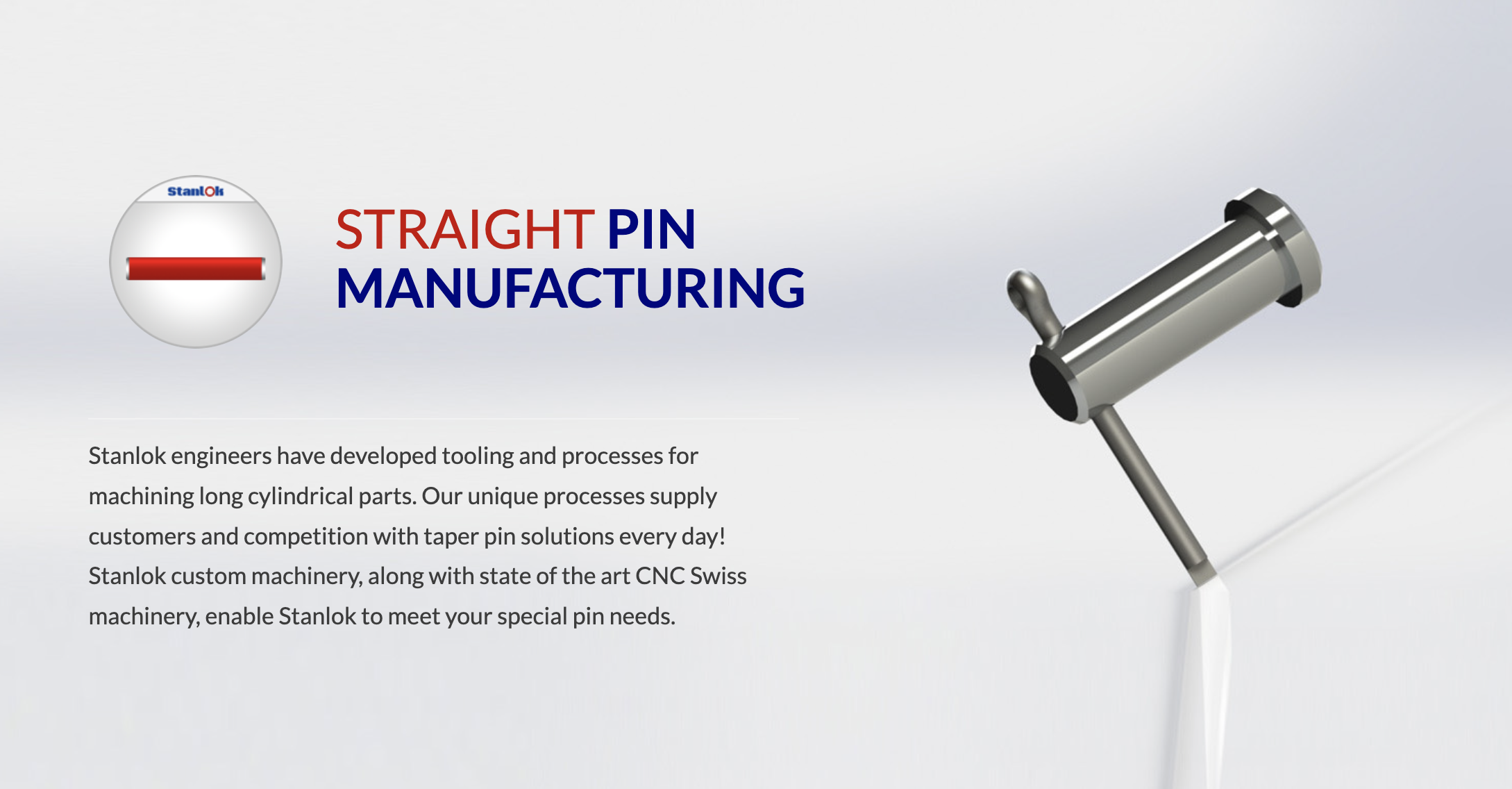
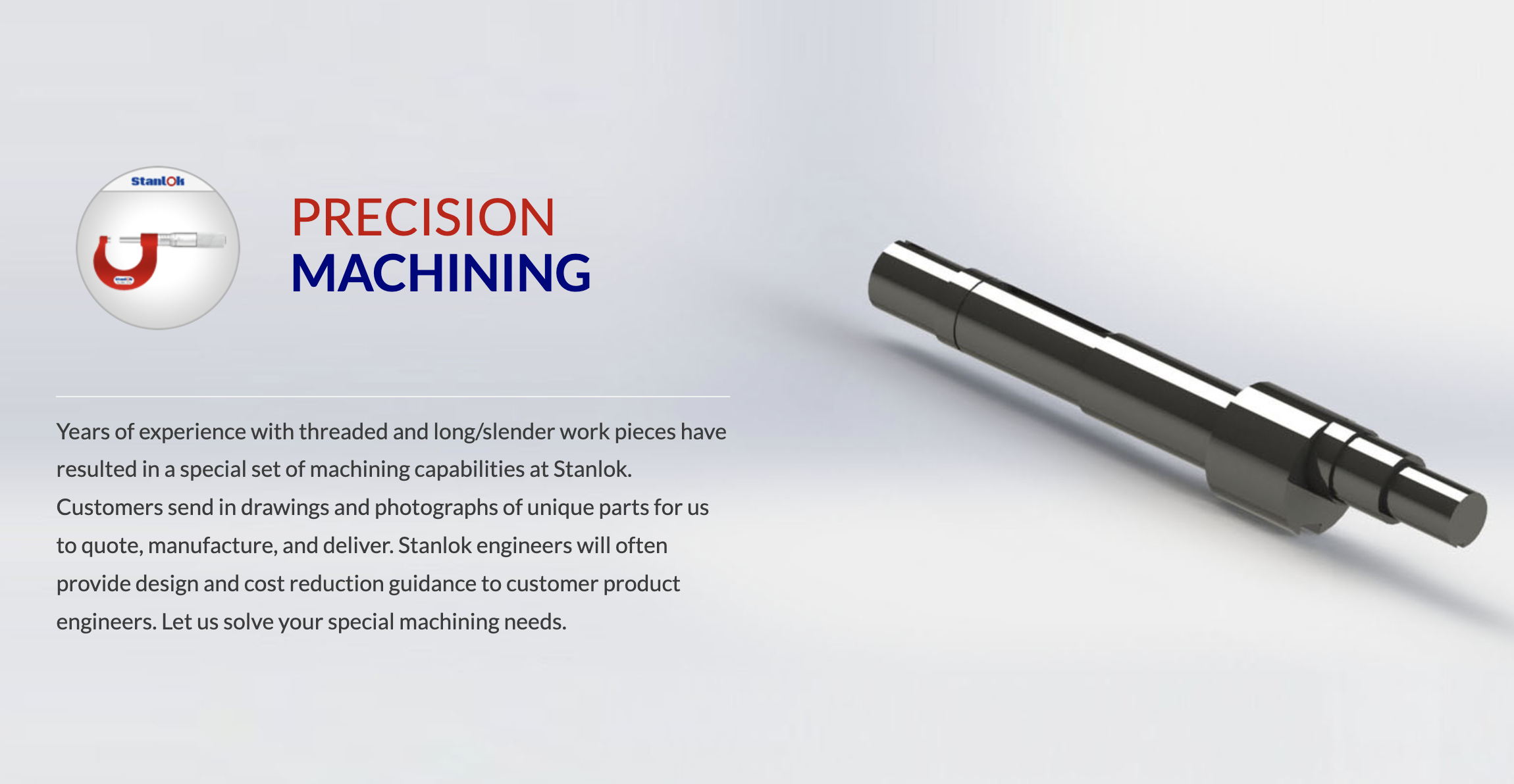
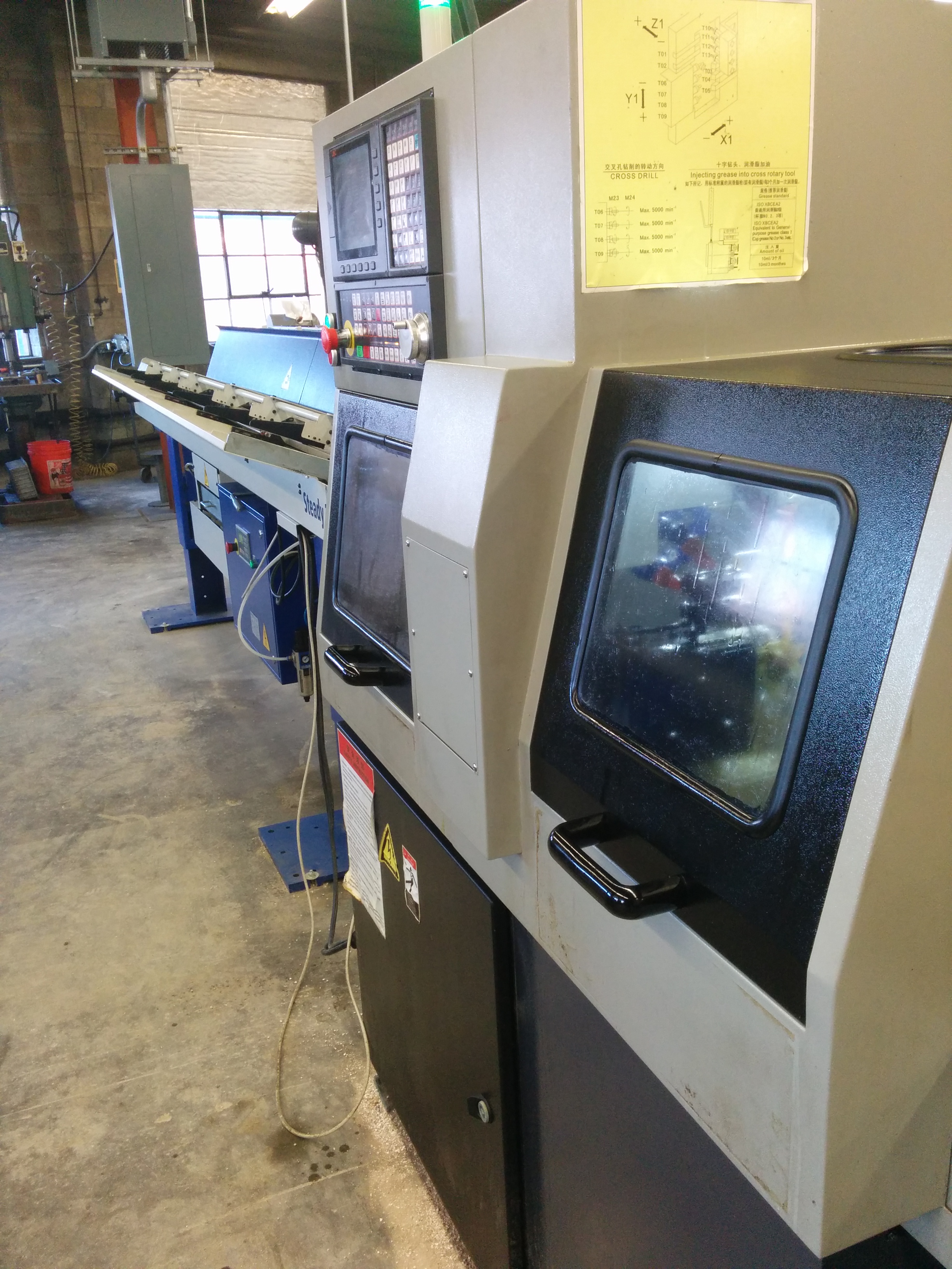
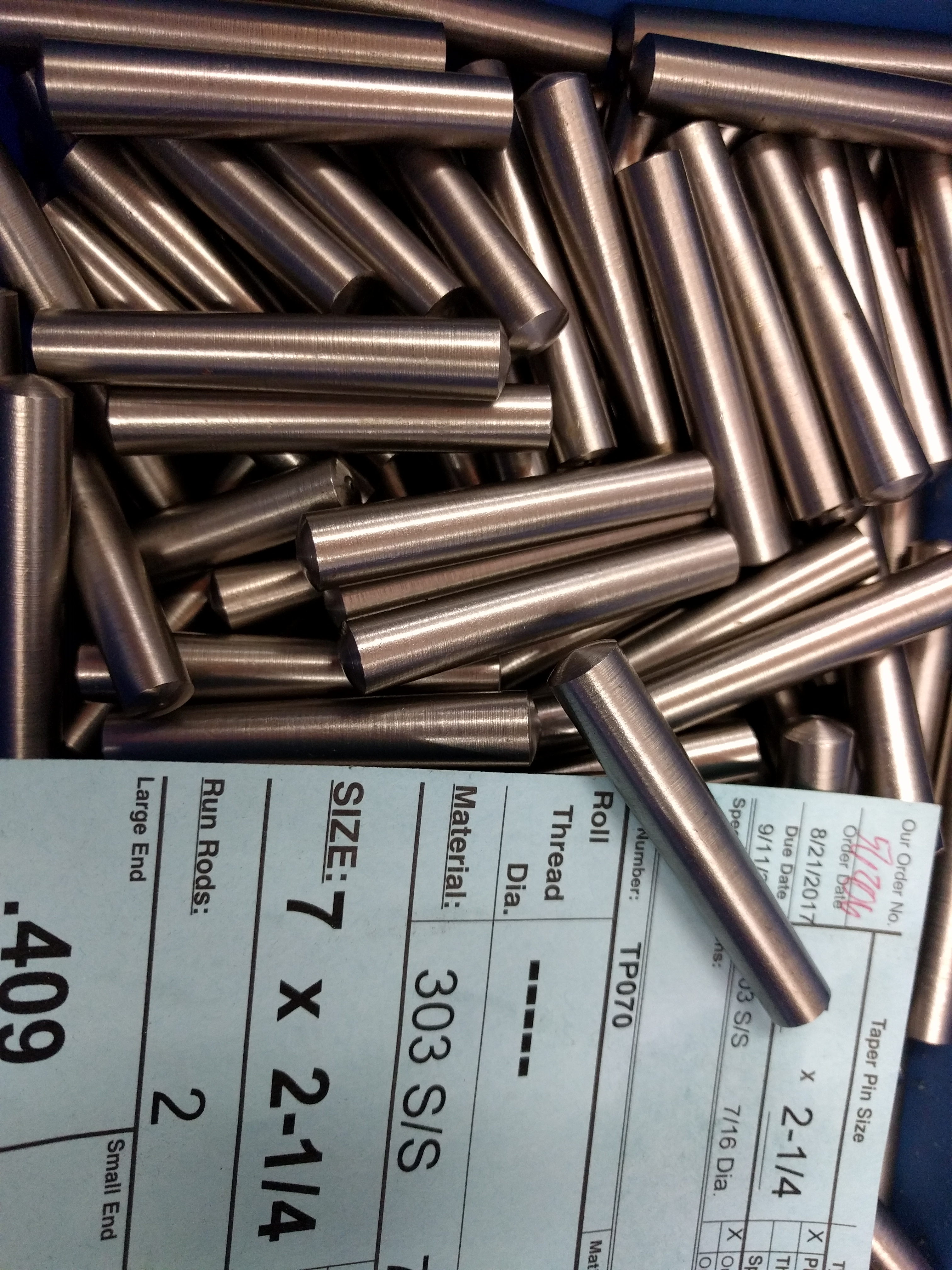
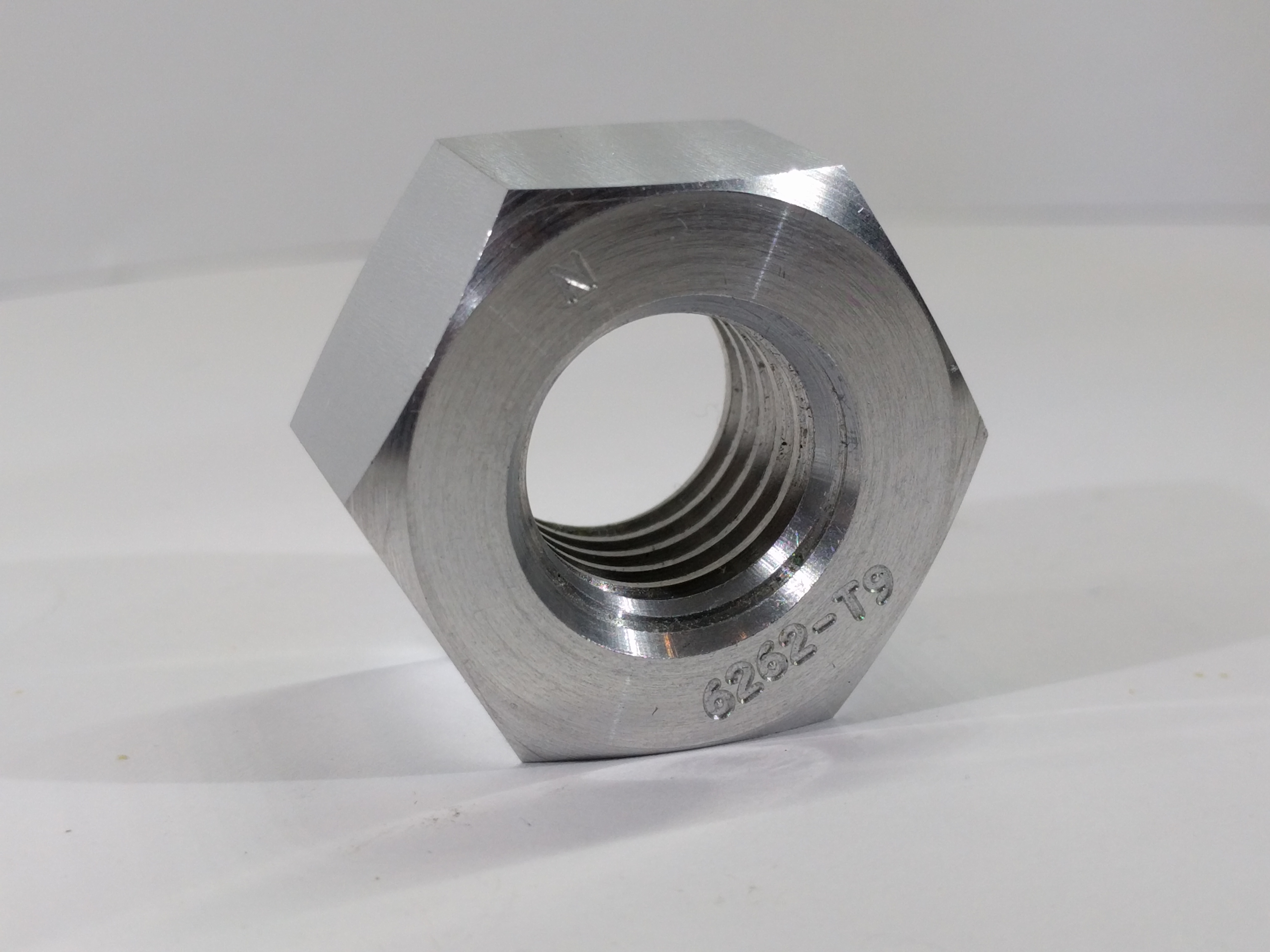
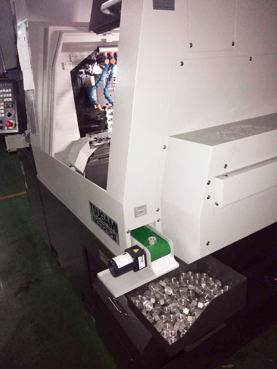
Stanlok's catalog is deep and highly technical - specialty nuts, straight pins, taper pins, custom CNC Swiss machining, assembly, distribution, packaging - and the people evaluating it are engineers on deadline. The site had to make that catalog scannable, give each product line its own visual identity, and route every path back to a quote request.
I built the full site end to end, structuring it around the four core product categories with hero-driven product pages, an RFQ-first contact flow, and rendered product backgrounds that separate each category at a glance. The brand system - deep navy, signal red, and technical typography - signals precision without leaning on stock industrial clichés.

• Custom Icons
A custom icon system for every product line and service
Stanlok's catalog spans specialty nuts, straight pins, taper pins, machining, assembly, engineering, packaging, and distribution - each a distinct offering that deserved its own visual shorthand. Stock icons wouldn't cut it, so I drew a full custom set where every mark echoes the actual part or process it represents.
The icons work as navigation, as product category markers, and as punctuation throughout the marketing system - tying the site, collateral, and print deliverables into one visual language.